A great company has a great logo. Everybody is familiar with some of the iconic ones, such as the Apple logo or the Starbucks emblem. Steve Jobs once paid $100.000 for his Next company’s logo.
I did not intend to spend an amount like that. But nevertheless, I think it is valuable to have a great logo that emphasizes the experiences it stands for.
The first thing I thought of, was a drawing I used to make a lot when I was in school. A fish with teeth, glasses and Chinese eyes. I thought this was quite original. I started drawing it on a paper and imported it on my computer with the help of the Adobe Capture app.

In all honesty, I was quite pleased with this logo.
I thought it was original, close to myself and funny.
However, my mother did not like it.
“Too agressive”, she said.
I realised, that she was right.
An agressive fish does not fit the kind of experiences I want to create.
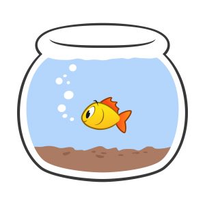
So I went back to the drawing board, and settled for a friendly, colorful fish in a bowl.
Maybe not entirely original, but very suitable.
And most importantly, I did not have to change the name for which I just had registered a domain.
Here it is.
Our Crafty Guppy.
May it swim and craft some amazing games.
